Vertical Solutions
Below are dashboards / reports for the deliverables asked for as well as a sample of other directions I exlpored.
You'll find dashboards, some statistical analysis, and custom visualizations that I believe offer some interesting content. I created the dashborads in Tableau (similar to Power BI), I uesd R and R studio for statistical analysis, and finally I created some fun visualizations using JavaScript (d3 api/library) and HTML/CSS. The visualizations are admittedly less practical, but still interesting.
Each dashboard has a brief explaination attached and I have included a summary of my findings at the bottom of the page.
Assumptions about data:- Times worked that are negative have signifigance and should be included in calculations
- Foremans "Justin" and "Justin Zimmerman" are two seperate people (they likely are the same person; however I treated them as two sepearte individuals for the purposes of the below)
- Total lunch time and Report total time variables are in minutes, total work time is in hours
- Finish% means wood finishing and does not mean the % of the total project that is complete
- The letters of walls (A,B,C, etc) has signifigance as I group them together several times
- Blank Task or Project values in the Labor Report are not purposeful and are treated as Null or "job not listed".
Notes: Labor Report came with a row that appears to have a sum in the bottom row, the sum is incorrect and was excluded. There also appears to be a missing employee (Employee #6).
Dashboards

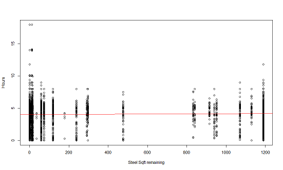
Above are two charts, both showing the Status of each resource over time. The top chart shows the status (in % completed) of each resource (Pads, Finish, Steel, etc) and the bottom chart shows the status in Sqft remaining. You can filter for each project (Woodpine, Cherrtown, etc) over the two month period available. Each resource is a unique color and each project location has it's own row. You can filter the resource statuses on the right side by time and Foreman as well. You can group the information my month (May or June), by 1 or multiple weeks, by the exact date, or you can use the Time slider to create a custom date range.
The first observation I made was about the time it takes for each resource to reach 99-100%. It appears that while Pads are always started last they are usually completed the quickest. Steel also is always first (which makes sense as it is the structure). I'm assuming Rough% means some sort of rough skeleton that will support the Wood along with the steel because it always comes sequentially by steel and is followed by an increase in Wood. Cherrytown had the least amount of Sqft to complete and only 1 wall, understandabley the sections all completed much quicker. No other project was marked as fully complete in the time-frame given. However, Walls C and E saw an interesting trend in which there is more overlap of tasks/resources worked on at a time. This brings me to the question of does working on tasks sequentially rather than concurrently decrease the time to complete a project or would concurrancy (with obvious limitations) improve the speed of completion?Important: Some days had multiple reports. So, each day is represented by the final report for that day or the "max" status % for that day. Example: if a crew started a day at Finish% = 23% , had Finish% = 50% mid day and ended at Finish% = 75% Then you would see 75% as the value represented for that day. With no filtering it will appear as if some Walls were started much earlier than they were in reality.
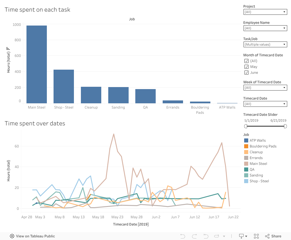
This dashboard looks at the hours worked on each task and filters by Project, Employee, and Time. Use the dropdown menus on the right to filter the data. You can see which employees where spending time on which tasks and on which project. You can also see in the bottom chart how the hours worked on a task change over time. You can group the information my month (May or June), by 1 or multiple weeks, by the exact date, or you can use the Time slider to create a custom date range. Someone more familiar with the build process / what the values mean may be able to quickly spot tasks that are using unnecessary amounts of time. Using the information from the previous dashboard we can also see that there is a general spike in hours worked among most tasks when a project begins the Finish, Steel and Wood stages of building.
Important: NULL means the employee did not enter the task name they were working on or it was not recorded
Other Dashboards

This is an additional dashboard to view the connection between the Foreman and various job updates. You can see which foremen have the most delays, noteworthy perfomances, client feedback, and the average (median) hours worked. You can also filter by time, so if you would like to see all those values on a specific date or week you can select those days in the filter on the right side. It appears that delays rarely come from the Owner and are instead Other. Based on how there seem to be delays where there are also Equipment requests then I would say the delays that happen tend to come from needed equipment. Predicting/foreseeing these incidents could help prevent future delays. Speaking with Jeffery who has experienced these "Other" delays the most and Richard who has had no delays but the most equipment requests per report would be useful. Assuming Noteworthy performances are positive, it would also be useful to speak with Richard because he has the highest number and ratio of Noteworthy Performances and likewise, Jeffery has the highest number of Client Feedback (more feedback is generally good, but feedback can be negative as well - I'm not sure what feedback refers to in this case).